PlayPlex+ Design Language Documentation
Platform: Desktop, Web
Role: UI/UX, Front-end development, Documentation
As we started the process of redesigning Viacom’s streaming platform PlayPlex+, our overarching goal was to build a consistent visual system that would scale across Viacom’s multitude of brands. The system needed to walk the fine line of highlighting each of our brands, while maintaining visual consistency. We tackled this by building a design language that defined each element, atom, and molecule of Viacom’s brand - which would facilitate a more cohesive experience, while streamlining the development process.
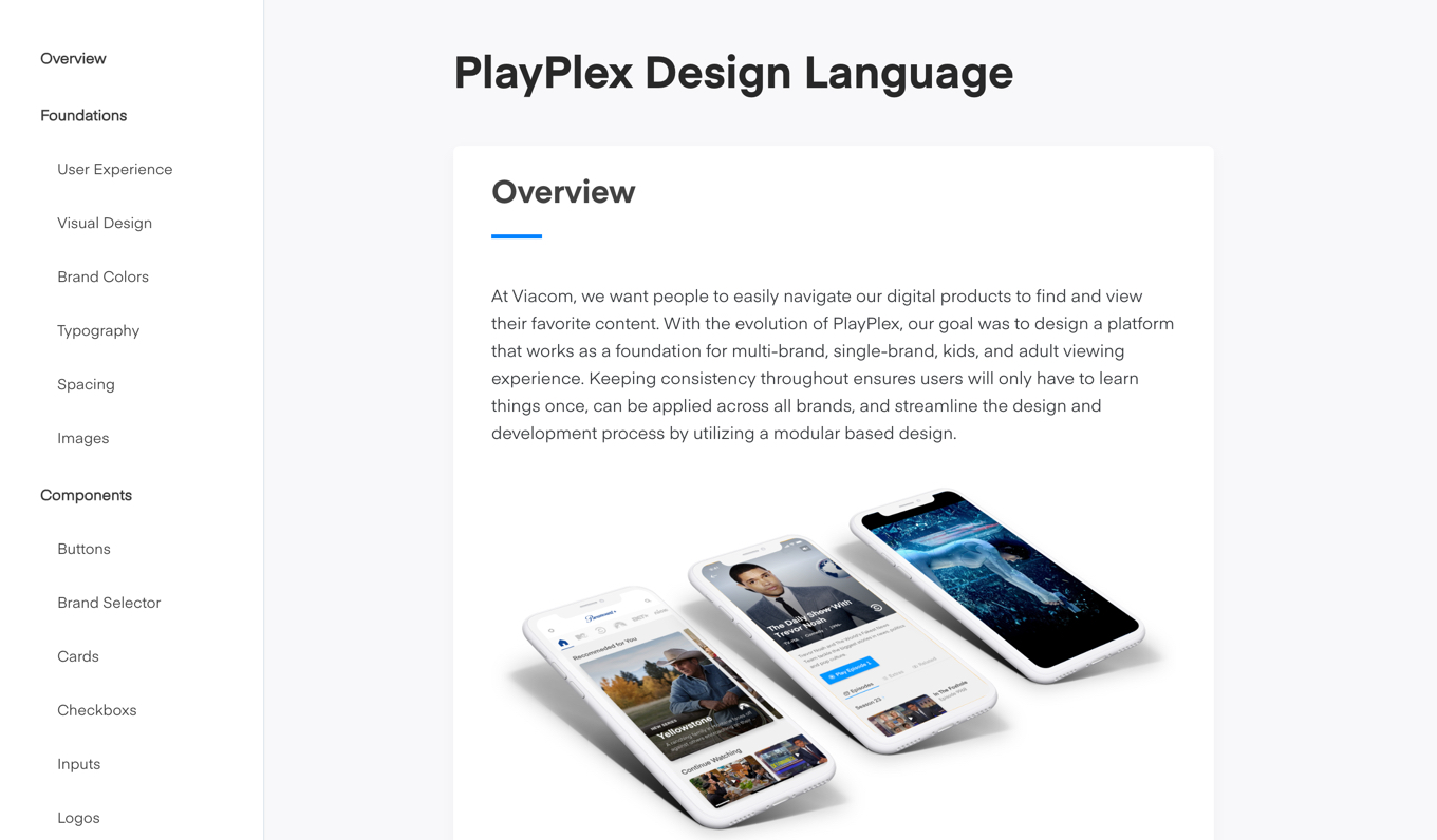
Challenges + On-boarding
Building digital products is a collaborative process, with a lot of moving parts - each one of those parts needing to fit perfectly together to build a unified system. From a design standpoint, we ran the gamut of synchronizing our efforts: from working with brands to implement their brand style to our platform, to using our DLS to on-board new designers. Though each new contributor brought their own unique solutions, the collective goal was to allow each brands’ identity to shine within a modular system.
A process is only as effective as a team’s ability to implement it, as was our designs. We had previously dealt with many challenges within the implementation process: colors incorrect, fonts too big or too small, inaccurate spacing, etc. To add another layer of complexity, our entire development team was based in Europe. By defining each component from type styles to buttons on a design-to-code level, we were able to ensure that developers had all the information they needed to build designs across platforms and devices.
Building the foundation
We started by identifying the foundations in which we would build PlayPlex+ on. By auditing the in-market app at the time, we identified what we’d like to take and what we’d like to improve upon. Some ideas were to maintain a card based approach that could scale within a modular layout, allowing for the flexibility to swap out cards, thumbnails, and posters. Next, we began building out a style guide in sketch and started to document our core foundations.
User Experience
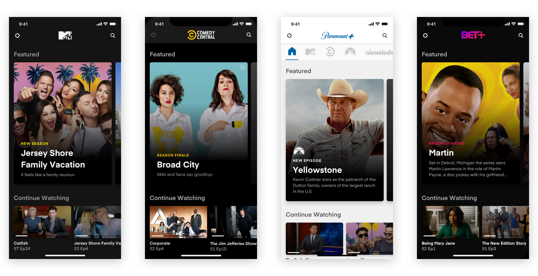
Designing for multiple brands, different demographics, and languages meant building a platform that can scale without changing the overall experience. We wanted to put the user first, ensuring they’d be able to apply the same interactions throughout the PlayPlex suite of apps. By creating a consistent experience throughout, we were able to encourage users to explore new content by browsing through our vast catalogue. In turn, we were able to increase business value through an immersive, content driven experience.
Accessibility
Web and software experiences should be accessible for all people. Designing across the spectrum of accessibility needs allows us to create an ideal experience for all. We based our accessibility standards on WCAG AA. By creating best practices, we can ensure that any and all designs we launch have been rigorously vetted to meet all web and software accessibility compliances.
Visual Design / Branding
Visual design foundations are the elements of the interface that craft the brand’s styling and message to users. We utilized bold images, clean type, and iconic brand colors and tried to create an engaging and immersive media viewing experience.
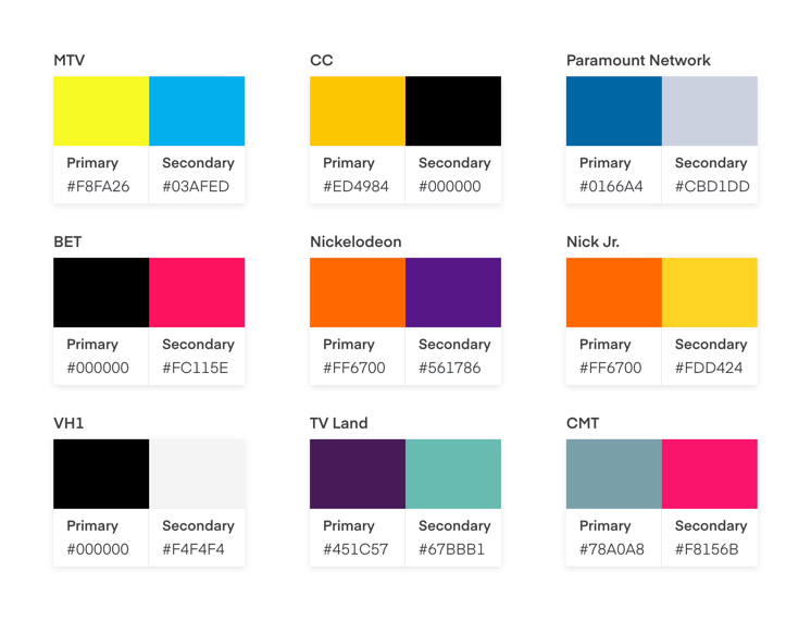
Primary and secodary brand colors which are applied throughout each brand's respective app
Typography
Storytelling is a large part of what we do at Viacom. Besides video, type is the main way we communicate with our audience. We used Eina, a versatile and multipurpose sans-serif. It was chosen for it’s legible and humanistic characters. Eina helped us craft a consistent visual message that worked for each of our brands.
Below shows a few examples of our type styles and how we translated them from design to platform specific code.
Title01
Eina01 | Bold 28px | letter-spacing: 0 | line-height: 30px
Usage: Feature card titles
Title02
Eina01 | SemiBold 14px | letter-spacing: 0 | line-height: 16px
Usage: Playable thumbnail titles.
Title03
Eina01 | Bold 14px | letter-spacing: 0 | line-height: 14px
Usage: Secondary titles.
H1
Eina01 | Bold 28px | letter-spacing: 0 | line-height: 34px
Usage: Home screen brand names.
H2
Eina01 | SemiBold 20px | letter-spacing: -.2 | line-height: 22px
Usage: Section titles.
Body01
Eina01 | Regular 14px | letter-spacing: 0 | line-height: 20px
Usage: Feature card descriptions.
Title01
class var title01: UIFont {

   												 return UIFont(name: "Eina01-Bold", size: 28.0)!

 										 }
Title02
 class var title02: UIFont {

										    return UIFont(name: "Eina01-Bold", size: 14.0)!

										  }
Title03
 class var title03: UIFont {

										     return UIFont(name: "Eina01-Bold", size: 12.0)!

										  }
H1
 class var h2: UIFont {

										      return UIFont(name: "Eina01-SemiBold", size: 20.0)!

										  }
H3
 class var h3: UIFont {

										      return UIFont(name: "Eina01-SemiBold", size: 20.0)!

										  }
Body01
 class var body01: UIFont {

										      return UIFont(name: "Eina01-Regular", size: 14.0)!

										  }
Title01
<style name="Title01"> <item name="android:textSize">28sp</item> <item name="android:lineSpacingExtra">-6sp</item> <item name="android:textColor">#fafafa</item> <item name="android:fontFamily">@font/font_bold</item> <item name="android:maxLines">3</item></style>
Title02
<style name="Title02"> <item name="android:textSize">14sp</item> <item name="android:lineSpacingExtra">2sp</item> <item name="android:textColor">#dcdcdc</item> <item name="android:fontFamily">@font/font_bold</item></style>
Title03
<style name="Title03"> <item name="android:gravity">end</item> <item name="android:textSize">12sp</item> <item name="android:lineSpacingExtra">2sp</item> <item name="android:textColor">#1e1e1e</item> <item name="android:fontFamily">@font/font_bold</item></style>
H1
<style name="H2"> <item name="android:textSize">20sp</item> <item name="android:lineSpacingExtra">4sp</item> <item name="android:textColor">#a0a0a0</item> <item name="android:fontFamily">@font/font_semibold</item></style>
H3
<style name="H3"> <item name="android:gravity">center_horizontal</item> <item name="android:textSize">20sp</item> <item name="android:lineSpacingExtra">6sp</item> <item name="android:textColor">#dcdcdc</item> <item name="android:fontFamily">@font/font_semibold</item></style>
Body01
<style name="Body01"> <item name="android:textSize">14sp</item> <item name="android:lineSpacingExtra">2sp</item> <item name="android:textColor">#8c8c8c</item> <item name="android:fontFamily">@font/font_regular</item> <item name="android:maxLines">3</item></style>
Spacing
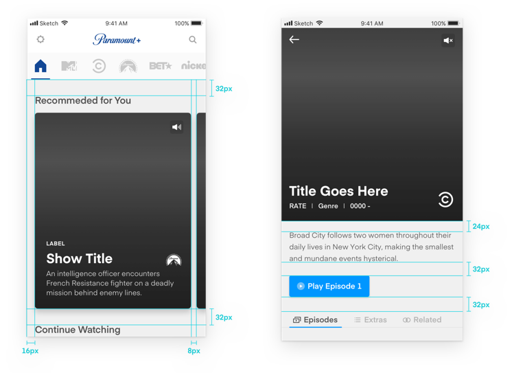
We used an 8 pixel grid. This promotes consistency between elements, accommodates most screen resolutions, and reduces time spent trying to decide what spacing to use for both design and development. Spacing is critical in creating hierarchy and balance within an interface. Applying consistent spacing improved information hierarchy and cognitive load, guiding the user through options and actions.
Images
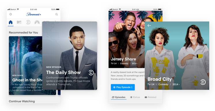
Images have a powerful and lasting impact on our users. By providing them with the most visually engaging assets available, they will be encouraged to watch, browse, and discover more content. We explored key art in a way that represents our content in an immersive and impactful way.
Creating the Components
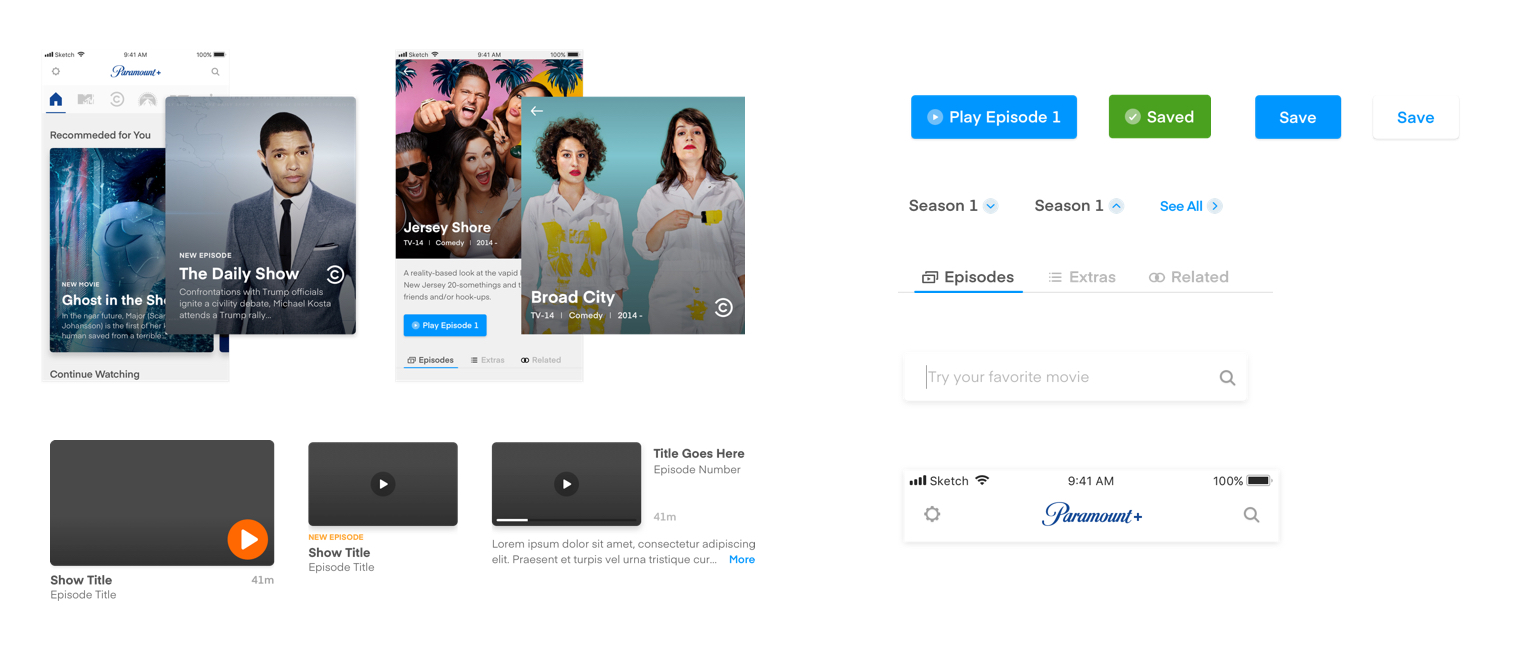
Next in our process, we began to build out our components in sketch. Our goal was to create an “ecosystem” of components that would lay on the foundations we built beforehand (i.e color styles, text styles, spacing guidelines). We also wanted each of our components to have the flexibility to adapt to different screens and sizes. From experience in implementing past designs, we knew the challenges of designing universal components that span across platforms. We chose to break them up into iOS and Android.
Example components
We created a master file where we categorized each component by its action. From buttons, text inputs, and thumbnails, to navigation, cards, and posters - each component was organized by the function it served. In this stage, documentation became even more crucial. With the possibility of losing track of what changes had been made, we treated this as an evolving system: we consistently analyzed what worked well vs. what could be improved to create a design “ecosystem” that would grow and evolve.
Assembling the Screens
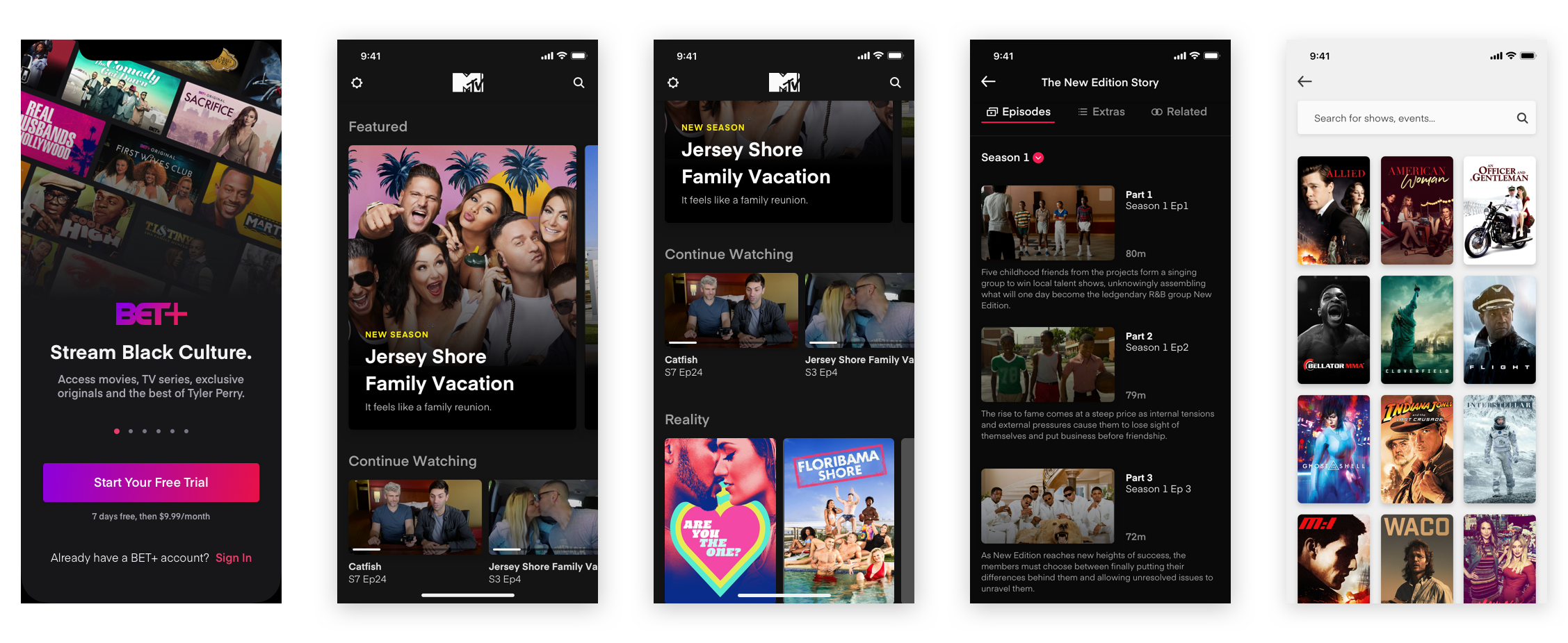
Once we had all the components fully flushed out and designed in a master sketch file, we began to build the screens. This instantly increased productivity within our design team. We were able design multiple screens at once using a unified design language, making it easy to create a cohesive visual experience throughout the platform.
During this time, we had a few new designers join our team. Having our foundations and components pre-defined helped on-board them to them. Within a few days they were making meaningful contributions to the team by producing key platform features utilizing the design system.
Learning and Evolving
Building this system didn’t come without it’s fair share of challenges. Having to design for a platform that can scale to fit the needs off up to 8 brands is no easy task. From re-defining the overall use of a component based on feedback from our product and development teams, re-designing to accommodate platforms specifications (iOS/Android), and the challenge of introducing a new system of communication into a well established product environment.
From the onset we knew this would be a project that was never done. Throughout this process we constantly evaluated what was working and what wasn’t, to ensure that the PlayPlex DLS solved not only our design teams needs, but the needs of the business itself. We worked diligently with engineering to implement each component, learning and reassessing all facets of the system along the way. Today we are hard at work on PlayPlex DLS 2.0 with a focus on cross platform sharing, versioning, and quick prototyping. The challenges are still there but we have a strong foundation to build upon.
