ViacomCBS: PlayPlex+ (2018-2019)
Platforms: iOS & Android
Role: UI/UX, Prototyping, Product Strategy & User Research
To stay competitive in the saturated marketplace of streaming services, Viacom needed a digital refresh. The in-market mobile and TV apps lacked features that users valued and had been accustomed to. To go along with user needs, content producers from Viacom’s brands desired an app that allowed them to curate, feature, and market content to new and existing viewers. Our design team was tasked to create an app that solved these issues for our users and businesses along with being scalable enough to adapt across multiple brands and platforms. Enter… PlayPlex+.
Historical context: PlayPlex (OG)
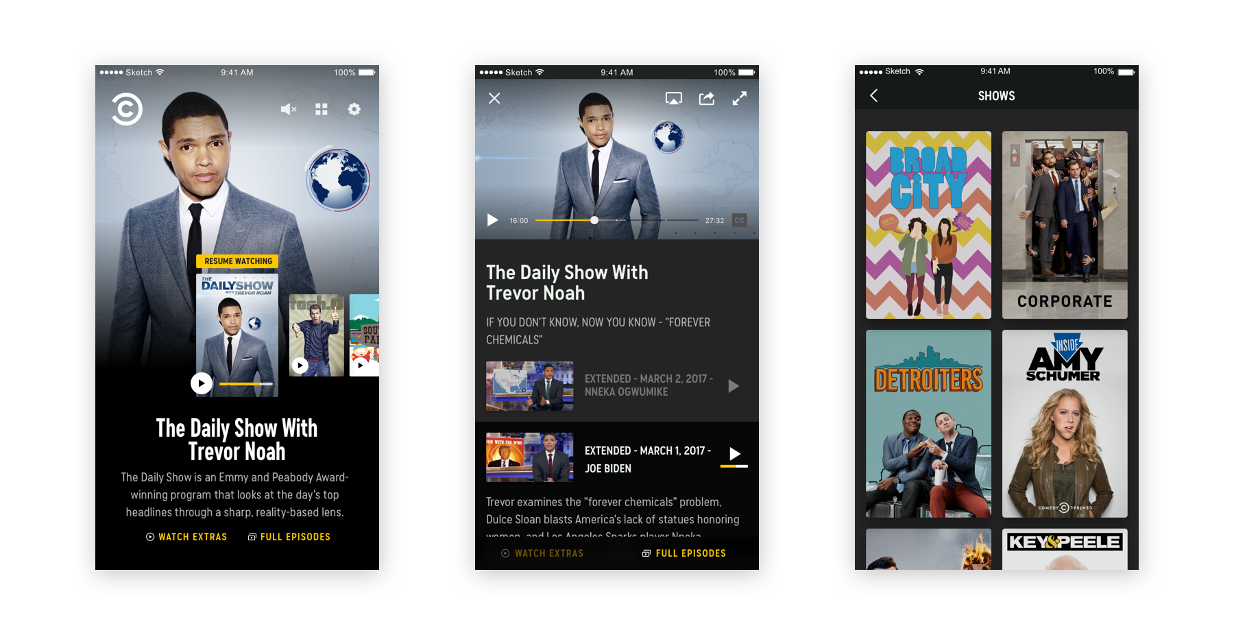
The first version of PlayPlex, Viacom’s first SVOD (streaming video on-demand) app was going on 5 years old, and certain areas needed to improve to fulfill our users' evolving needs.
A few examples
- Only one row of curated content on the home screen
- Accessibility concerns based on allowing brands to dictate font styles and colors
- A fully functional search
- Unorganized content within series pages
Overall, there was a huge opportunity to highlight more, curated, and exclusive content for our users that first generation PlayPlex had been missing out on. We were excited to dive into a total redesign.
Researching the problem
Before we kicked off the redesign, we paired with user research to dig a little deeper into what our users valued about our existing apps. In a series of sessions, we talked with them about what they liked, what they felt was missing, what was downright confusing, and what they’d like to see (if anything) transitioned over to PlayPlex+. From these working sessions, we gathered valuable feedback but a few repeatedly came up.
Continue Watching
The majority of users came into our apps with a specific show or movie they wanted to watch or continue watching. However, the current home screen didn’t support this feature. To make matters more frustrating, users had to dig into the content detail screen and the only indicator of recently watched was a small progress bar below the contents metadata.
Personalization
In many streaming services our users were accustomed to, they were offered personal recommendations for new and existing content, tailored specifically to them based on their viewing history.
Search
PlayPlex OG only had a browse feature, meaning our users could only scroll through posters of series, movies, and events to find their content. A more robust search was needed.
Over the course of several weeks we distilled these finding into actionable design tasks. We worked in tandem with product to prioritize specific features and identifying the main screens needed for MVP.
Early Explorations
Our design team began to wireframe the main screens, starting with the home and container screens. We begans sketching low fidelity mockups, not worrying about fully flushed out visuals. Below are a few examples of sketches and early design work from this process.
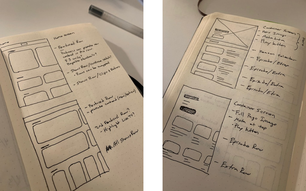
Initial wireframe sketches for home & container screens
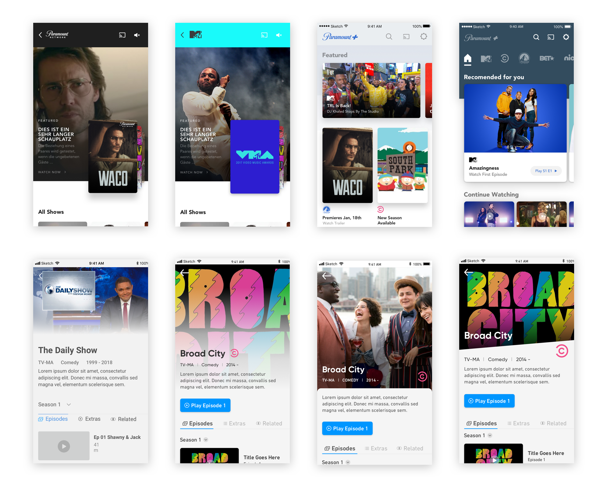
Design explorations for home & container screens done for Paramount+, the first app onboarded onto the PlayPlex+ platform.
Designing the Solution
From the time we spent talking to users, gathering feedback, and iterating on design explorations and wireframes we felt confident in a design direction. Alongside three other designers we started on the home screen, exploring design options without the fear of constraints. Based on these exercises we came away with a framework for a home screen that offered users the ability to to quickly find the content they came for while highlighting and curating new and existing content from the brands producers.
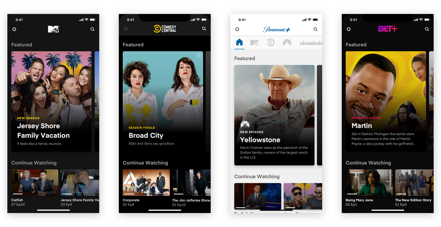
Utilizing rows, the user is presented content in an easily digestible layout while also serving our producers ability to curate each row.
In tandem with the home screen, we were designing the content container screens. This is the screen a user sees when they click into a series, movie or event. In first generation PlayPlex (OG) the container screen used a 16:9 video player at the top, which we chose to remove. The idea being that only allowing a landscape viewing experience would be more immersive and commonly expected interaction. This freed up space to give the container screen an organized layout to display all associated metadata while utilizing a tab system to show extras, clips, and related content.
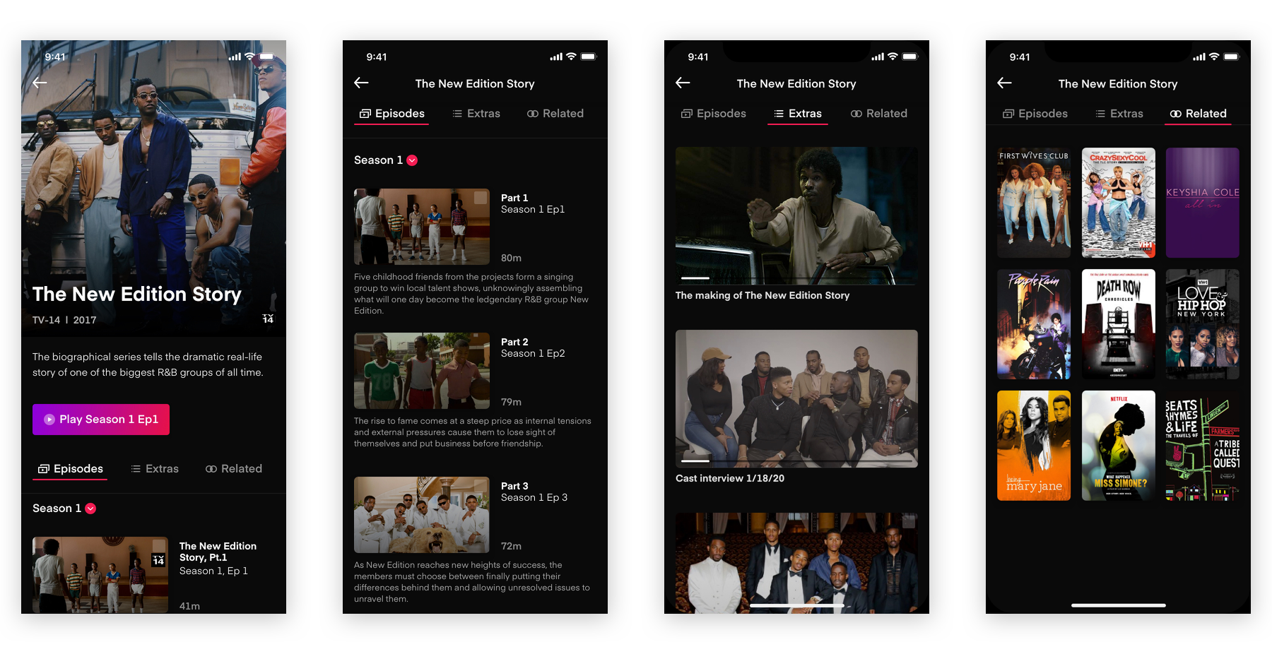
Content container screens (episodes, extras, and related)
Our process continued with the search screen, as always we consulted the user research we’d done. By distilling the user interviews along with completive analysis, we designed a predictive search showing results as the user entered text within the search field. If no results were shown, users were offered recommendations based on their query.
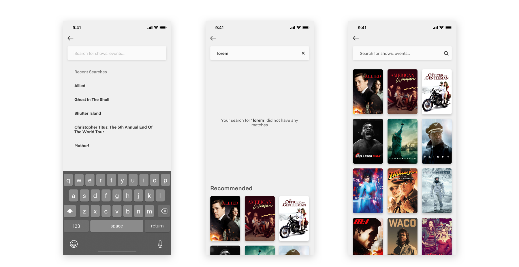
Search shown on Paramount+
Each of the previous screens shared the same purpose, organizing content in a easily digestible and interactive manner, to help the user find content. All of these screens had a common goal, lead our users to the video player. We knew it’s shortcomings, the play button was too small and positioned in an awkward spot. Fast forward and rewind also needed to be presented in an easier to use format, especially for a mobile viewing experience. Amongst a few others.
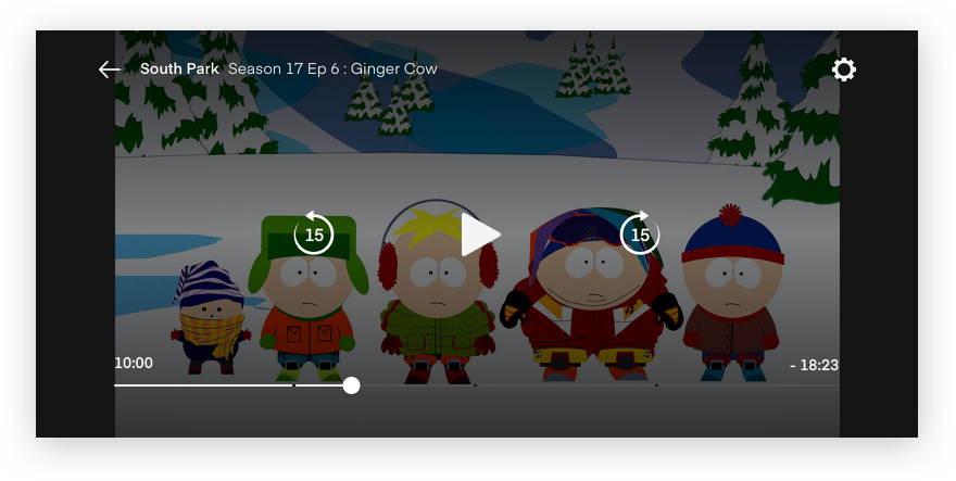
Centering the play button and moving the fast forward and rewind icons to the left and right proved to be the best solution based on a users preferred interaction while holding their device
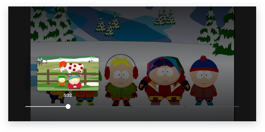
Users wanted to be able to preview content while utilizing the scrubber bar, so we implemented scrubber thumbnails
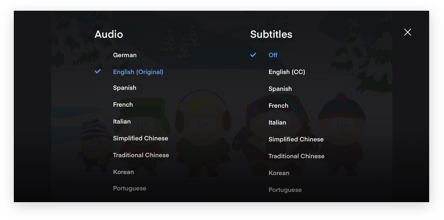
Prioritizing accessibility needs of those who needed or wanted to utilize subtitles or to listen in other languages.
Maintaining a System
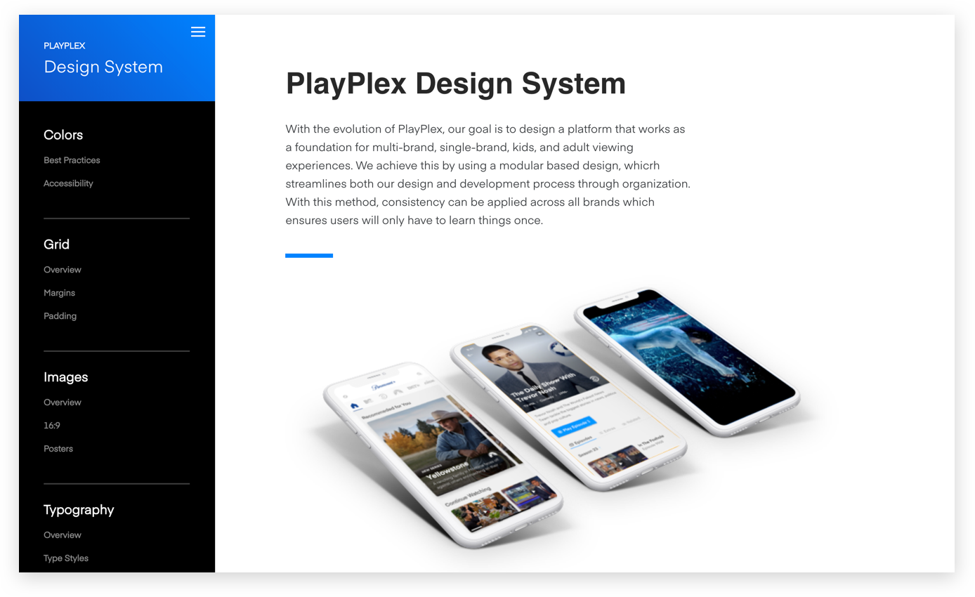
The key to implementing the designs was to have a clear and open dialogue with developers. We worked in collaboration to implement each interface element to the specs they had been designed. Adjustments were needed to serve specific platforms and development constraints. As the system was being built, it evolved and still is to this day. Currently our team is working on the challenge of on-boarding all ViacomCBS websites onto out design system.
Launch
MTV
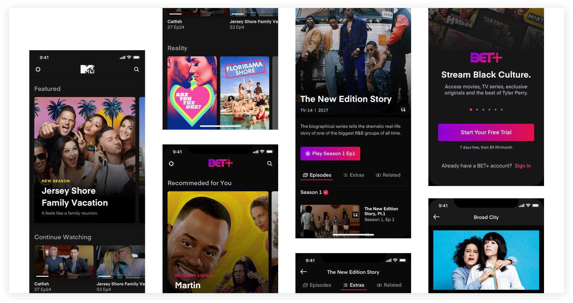
The first app we launched on the PlayPlex+ platform was MTV+. Launching in the UK, Brazil, and the Nordics. This was the first direct to consumer digital product Viacom had ever released and a huge step forward for us as we entered the world of D2C streaming services. Immediately, there was a positive impact on our business.
BET+
Over the course of the next few months we worked with BET to implement the styling and business needs of their streaming service BET+ onto the platform. This was a huge coordinated effort, from the marketing teams, to development, product, and design. We launched in late September and as of February 2020, there were 500,000 paying subscribers - a milestone we’re certainly proud of.
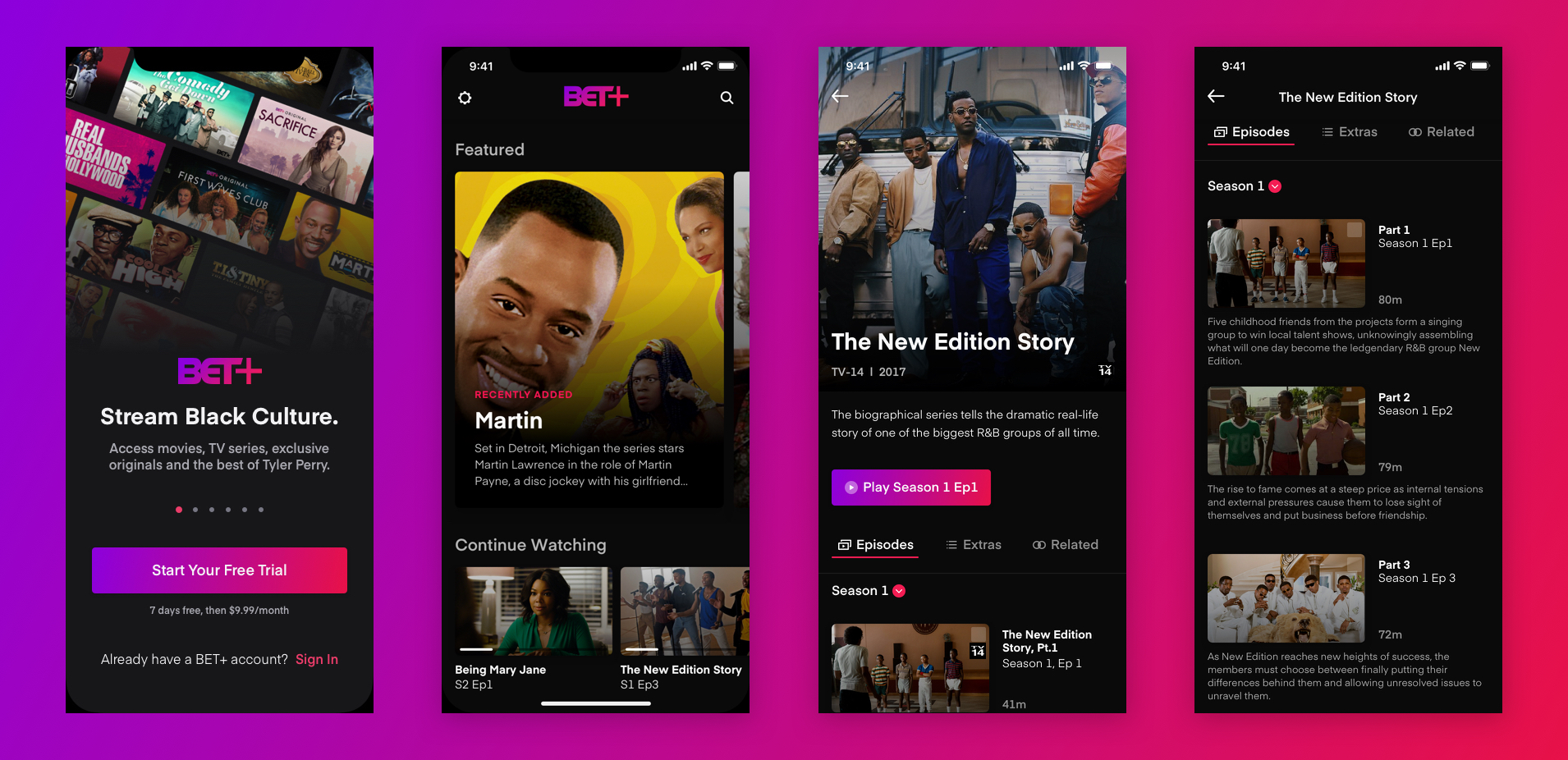
A big thanks to the talented design team I've been fortunate enough to work with and all of their amazing work. Jean Kwon, Danny Kim, Susie Sobota, Al Lucca, and Jason Grotrian. As well as the fantastic product and development teams.
